Color-blindness is one of the most common disabilities in the world, affecting as many as 1 in every 12 men and 1 in every 50 women. The United States, population 330 million, is home to roughly 13.5 million color-blind men and a further 3.3 million women. If all these color-blind people lived in the same state, it would be the fifth-largest state in the country. (It would also probably be the only state that didn’t use red for stop and green for go on its traffic lights!)
Yet despite the common nature of color-blindness and the numerous ways it can impact life for people in general and gamers in particular, the gaming industry – both board gaming and online gaming – is only slowly waking up to the unique needs of individuals who don’t see things the same way everyone else does.
One Player’s Story
I was nine years old when I first began to realize something was wrong with my vision. That year, I accidentally referred to the blue chairs in my classroom as purple, or possibly vice versa. I started getting bad grades in art that year—what elementary school student gets a bad grade in art?—because my marker drawings didn’t look right. At age sixteen I finally mentioned something to my eye doctor. They administered the Ishihara test to me. In the circles full of colored dots, I was supposed to see certain numbers. Instead, I saw either the wrong numbers or nothing at all. My eye doctor diagnosed me with Deuteranopia, a red-green deficiency, the most common form of color-blindness. (You can take the Ishihara test for yourself right here.)
I wouldn’t say that color-blindness affects my life on a daily basis. I dress mostly in a narrow range of colors that all match each other in case I happen to grab the wrong one off the shelf. At my brother’s wedding, though, I accidentally wore dark blue dress pants instead of black, which caused a minor fashion faux pas. Now I only own black dress pants.
Color-blindness does make the occasional intrusion. We could talk about the times I’ve been watching soccer games on TV and been unable to tell the team in red shirt and white shorts apart from the team in green shirt and white shorts, the times when writeups of soccer matches have included graphics using green for completed passes and red for incomplete passes – on a green background! We could talk about the time I had to referee a soccer match between a team in yellow and a team in orange. Trying to figure out which of them last touched an out-of-bounds ball is not an experience I’m eager to repeat.
Those situations are relatively rare, though. As I say, life is pretty much normal…except when it comes to games.
Color-Blind Accessibility In Games
Board games and video games are a particular issue for those with vision-based disabilities because colors are used to convey meaning. Witness games like Phase 10, where the card suits are different colors; given the opportunity to use any colors visible to the human eye, the designers picked red and green. Likewise Skip Bo. The co-operative “escape game” series Exit: The Game has a number of puzzles that can only be solved by people with normal color vision. When I reach one of those puzzles, I just have to hand the game to another player. Other modern games like Roll For It are slowly coming around; that game originally included dark blue and dark purple dice. It was nearly impossible to tell them apart. Eventually, though, the developers swapped the purple for black, and the dark blue became royal blue.
In video games, the problem becomes even more pronounced. Colors are used to convey meaning in real time. In a board game, a player who accidentally plays a card of the wrong color or places a blue die on a purple space can be corrected in real time with very little lasting harm. But in a video game, a player who can’t distinguish two similarly-colored blobs of gray will be promptly shot in the face when it turns out one of those blobs was an enemy player. (This situation was not helped in the slightest by a long and monotonous trend of dirt-themed first-person shooters, where it seemed that nearly every texture in the game was some shade of gray or brown.)
At the end of the day, though, the gaming industry is precisely that – an industry. If you want to make money, you cannot simply ignore the fact that certain creative decisions may cause the game to be less fun – or unplayable – for a full 8% of your potential male audience. Within the past ten years, both the board game and video game industry have begun moving toward full accessibility for color-blind players. On the board game side, the website Meeple Like Us offers “accessibility teardowns” of popular games, explaining how accessible they are to people with various disabilities, including but not limited to color-blindness. On the video game side, a growing number of A-list games are including a function that changes the way colors show up to certain players.
How Do Video Games Do It?
There are two fundamental ways of attempting to accommodate color-blind players. Hue-mapping is the easiest (and therefore least expensive for developers). It involves taking all the hues of a certain color, such as red, and shifting them toward a different color, such as blue. Now instead of red and green, you have purple and green. In theory, people are less likely to confuse them. The reality is, unfortunately, not so cut and dried.
The biggest problem is that hue-mapping changes all the instances of a given color. Here’s an example of how a popular color-matching game looks without (left) and with (right) hue-mapping.
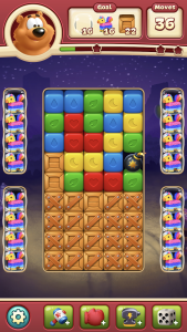
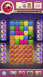
The reds are now easier to tell apart from the greens, but take a good look at the brown bear in the top left corner. In the second image he is extremely not brown. In fact, I don’t even know what I would call that color. Because it affects everything, and not merely the things that are problematic, hue-mapping ends up changing naturally colored things into unnatural. Take, for example, the human face:


Celebrity chef Robert Irvine is not a bad-looking guy, although I don’t understand why he has his own magazine, which is the reason I took the picture in the first place. With my iPhone’s Deuteranopia filter (Settings -> General -> Accessibility -> Color Filters) enabled, though, the photo looks washed out. All the red tones in his face have been shifted and the end result is…ah, not good. (A great example of the problem: I originally described his face as “a muted gray.” However, normal-visioned INN editor described it as more like “beetroot”. They even quipped “Who put him in the oven for ninety minutes?” It’s very difficult to even discuss colors at all when the two people in the discussion literally aren’t seeing the same thing.)
Hue-mapping is certainly one solution to the problem of color-blindness. However, it’s plainly not a very good one. It fixes certain problems, but causes others.
The alternative to hue-mapping – changing the color of individual icons and items within the game, instead of universally shifting all reds to blue – is obviously a lot more time consuming, which means a lot more expensive. It may be good business sense for a company to include color-blind accessibility, but it’s not good business sense to spend too much developer manpower on something that only a minority of players will ever have reason to use. I would say, though, that baby steps are better than no steps.
Color-Blindness In EVE
To CCP’s credit, when they decided to tackle the problem of color-blindness, they were determined to do it the right way. Color-blind support for EVE was announced less than two years ago, in May of 2017, and was implemented on the Tranquility server shortly after. One thing is immediately apparent, both from reading the dev blog and from looking at the settings in-game. CCP deliberately invested a significant amount of time and effort into their color-blindness accessibility. Players can choose from settings specifically tailored to Deuteranopia (the most common deficiency) or Tritonopia, and within each of those settings, each player can customize things to their own heart’s content. Rather than just blindly swapping certain hues, CCP made it possible for players to customize the colors for a wide variety of in-game icons and messages.
What exactly does this change in the game? I personally play on Deuteranopia settings, so here are a few screen shots showing what may be different between my display and yours.
What people normally call “yellow-boxing” shows up as blue for me; “red-boxed” is yellow (or light green or whatever) for me.

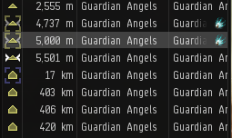
This screenshot from the X47L-Q Keepstar bash this summer shows (in glorious potato-graphic format) the way friendly and hostile players show up. These colors can actually be tweaked on an individual basis through your overview, so if (let’s say) corporation-blue and alliance-blue are still too close together, you can manually assign one of them a different color.
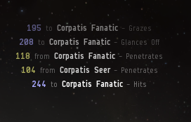
Incoming damage is red for you and yellow (?) for me; outgoing damage is green for you and blue for me. My wallet is the same way; expenditures are yellow (?) and deposits are blue.
Much of the “action” in EVE is not fast-paced enough to require instantaneous decisions. Ratting, mining, hauling, mission-running, and industry are generally very forgiving in terms of the time between inputs; if a player gets momentarily confused while ratting, the result is not generally the loss of a ship. PvP, on the other hand, does require rapid identification of friends and foes, hence why the color of friend-and-foe icons is so important. That is what makes CCP’s dedication to proper color correction so impressive: even though color vision deficiency only causes actual harm in a relatively small number of in-game situations, CCP chose not only to make the game color-blind accessible, but to devote real time and attention to the issue rather than going with the simpler, cheaper option of hue mapping.
How Can You Help?
Statistically speaking, most of the people reading this won’t have any color vision deficiency. However, if you’re in any setting with more than twelve men or more than fifty women, you are statistically likely to be in contact with at least one such person on a regular basis. As such, there are certain things you can do to help.
At work, if you’re preparing a visual image for a report or a presentation, ensure that you don’t use colors which may be easily mistaken. If your graph has two lines, for the love of God, do not choose red and green. Make one light and one dark. If you design a website, don’t make the text blue and the hyperlinks purple. If you’re making a sign that people may need to read quickly in an emergency, think about what colors you want it to be.
Really, that’s the most important thing you could do to help. Just be aware. Just pause to think for a moment. Color-blind people are, in general, accustomed to having our disability ignored. (Street lights all over the world use red for stop and green for go, just to give one example.) We appreciate even the smallest gesture of empathy because it’s so unexpected. Knowing that someone could have ignored you but chose to think about you and do something kind for you instead…well, that just plain feels good.
So be grateful for what you have, if color-blindness is a foreign disability to you. Be thankful for the sunsets you see, the pictures you paint, the games you play. And if, in some small way, you can help make life a little easier for people like me, I’ll be thankful for that too.