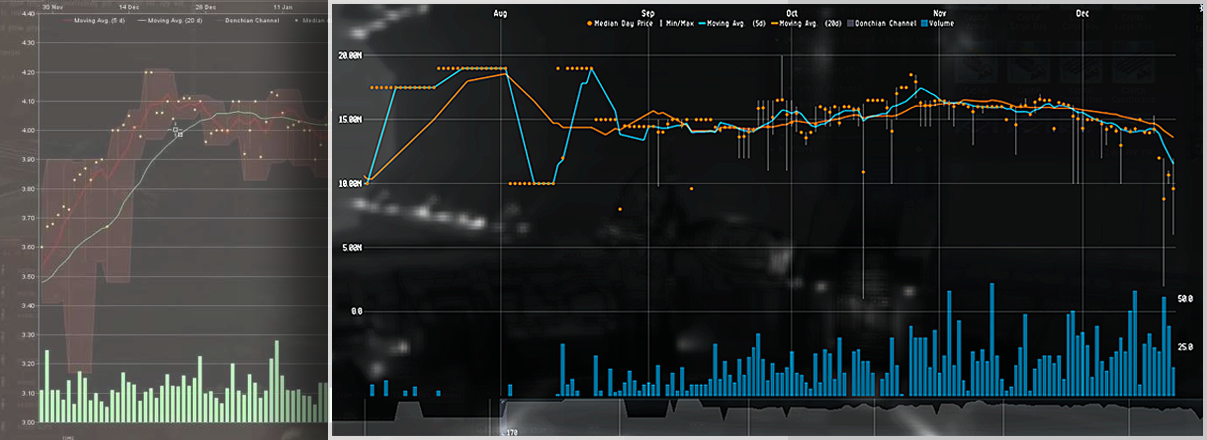
While the Rorqual nerf received most attention from the recent update, CCP also introduced new features to the Market Window to help new or lay traders better understand the dynamics of supply and demand. Some of this is a slight graphical change on familiar features, but there are also new functionalities. Per CCP Antiquarian, these changes are the following:
- The time period displayed can be controlled with the resizable and slidable focus box on the lower graph.
- The y-axis length and center of the main graph can be controlled with the scroll wheel.
- Each element of the main graph can be toggled off and on in the graph settings cog menu (upper right).
- Graph draw animations can also be disabled in the settings.
Data visualization is the art of depicting information in ways that is concise and actionable. When done effectively, it can summarize vast amounts of data to enable the user to glean insights that would otherwise take hours of reading spreadsheets. This skill is of great benefit to EVE’s marketeers as they scour thousands of items, prices, and orders to find the best margins. As someone who is a quant, I depend on the ability to depict data in ways that matter. The following article goes over how to get the most from the new visuals from the updated Market Window.
Analyzing an Item’s History
These new features make examining items on the market easier than ever before. Using the side-scrolling time period, one can focus on all sorts of time periods, whether they want to see long-term trends or short-term oscillations. This enables EVE’s marketeers to make decisions similar to actual commodity traders. They look at how prices span across all sorts of horizons and are able to take well-informed positions. In EVE, these cycles could be from day-trading to stockpiling for massive movements. The design of the slider is very clean as far as many trading tools go. People in the industry have battled with clunky menus and unintuitive interfaces for decades. It is interesting that a fictional universe is seen ahead of real-world best practices.
Graphs of Scale
The other new feature of scrolling the mouse wheel to adjust the y-axis has drawn some criticism from trader circles. It does not immediately help glean information from a single window in time. However, its use comes when seeking a closer or further look at multiple windows of time. The tricky thing with graphs is that they are easily manipulated based on the scale. That is, you can make a line look very different based on how you move the axes. So given the two options of auto-generated windows and the ability to customize, the choice is obvious.
Simplify, Simplify
Perhaps the best addition to these slew of changes is the ability to toggle variables from appearing on the graph. A temptation of data visualization is to pack in as much information as possible, often to the detriment of the viewer. The ability to remove aspects such as the Donchian Channel enables users to obtain the clearer perspective of the ones you actually care about for your preferred style of trading. A pioneer of data visualization, Dr. Stephen Few, is famous for advocating absolute minimal complexity in a graph.
A Reverse of Course
With the exit of the in-game web browser and many other non-core features, it had seemed that CCP was trimming the edges to focus on the roadmap. While this is a great call to the community to develop third party solutions, it can often add to the new player’s learning curve. This leaves some pilots at a disadvantage as they do not have the access or knowledge that many veterans do. However, these Market Window changes indicate that in-house analysis functionalities are still important to the experience.
Not all known issues with the Market Window have been addressed through this update. There are still reports of the graphs not detailing actual sales records, whether that be the prices or volumes. Then there are the mysteriously hidden orders from citadels that catch people by surprise. While these glitches might not be observed by many players, they can have massive influence over whether or not marketeers are successful.
Despite these lingering issues, there are many hopeful directions this Market Window could indicate. There is the attention to detail in the tangible interface aspects – intuitive and clean design. This could also be paving the way to features such as detachable graphs, player-made market dashboards, or in-game comparisons of multiple regional markets. If nothing else, the fact graphs got attention might point to the bugs being acknowledged and resolved. Unlike most people that play games, I am drawn to EVE by the ways it resembles my life. A better Market Window and the possibilities of its implications helps make me and other EVE Economists excited for what is to come.
The video below gives an quick demonstration of some of the new features.
